Friday, 15 April 2011

Wallace Collection

LABELS

The Wallace Collection like many small private historical collections that has become a public gallery probably uses the same frames the original collectors used. These ornate frames often included a plaque with the artist, title or subject of the piece, and date of creation. The Wallace Collection seems to have replaced most of these tags (because they include a catalog number) instead of putting separate labels on the walls. I think this was a good decision because it is more in keeping with the historical experience, it encourages a less museum/institutional feeling, and most practically it prevents any damage to the walls. Generally I prefer a separate panel, even in addition to a plaque label, just for additional information, but in this setting you aren't necessarily looking for an art education just the experience of seeing the collection. And it's nice not having to avert your eyes far from the painting to find out the artist so you can stay visually engaged with it.

OBJECT OF APPRECIATION

I was surprising interested in the armor and weaponry collection, it's fascinating that there can be so many lavish imaginations of the same thing. The heads of axes and the butts of rifles were extraordinary at times but I would love to return to my dear Bronzino because the Wallace Collection has a portrait from the studio of Bronzino of Eleonora of Toledo - perhaps a study for a later portrait of Eleonora with her son by Bronzino. I'm not totally sure why his works appeal to me so much, the expressions could be interpreted as blank but I like to think they are just sort of far away and immersed in their thoughts. Of course I have to mention Eleonora's luxurious dress and adornments, gorgeous! In the few minutes I have spent looking up the painting I have discovered her dress features a pomegranate motif symbolizing fertility, and it is thought that Eleonora started a trend of wearing pearl drop earrings with these portraits, and that her husband Cosimo de Medici I (Duke of Florence and later Tuscany), made her regent while he was away from home. This information encourages me to research more and appreciate the art more.

OBJECT OF EXCESSIVE DETAILS

In one room of the Wallace Collection there is a fabulous chandelier, I saw it and right away I thought "Object of excessive ornamentation? Check!" When I went to look for an information panel I saw a different label that intrigued me: 'Pair of Tripod Candelabra with goats' heads and feet with candleholders in the mouths of snakes.' I don't know if I need say more on this subject, perhaps just let them speak for themselves but I have to say I found these candelabra pretty hilarious and just so random. People were weird.


FAVORITE MUSEUM

My favorite museum visit this semester was probably the visit to the Saatchi Gallery. I really like this gallery, it's a really lovely environment with some interesting art. Because of Saatchi's mission to have people draw their own conclusions about the work it was great to have a guided tour to explain some of the work that I had previously seen and not understood. As a student working towards a BFA of course I am especially interested in contemporary art and the Saatchi is one of few prominent locations to see new working artists without an intimidating setting.

MUSEUM INTEREST

I can't say my interest in visiting museums has increased after this course, because I have always considered art museums an important part of my life and an important part of visiting a new place. I do think it has made me a bit more willing to visit types of museums other than art museums. 
Similarly, I have had an interest in museum branding and design for a few years but the course was helpful in putting me in a critical mindset during the museum visits for class. And art doesn't scare me, art is fun! And it can be whatever you want!

COMMENTS

Thanks for all the effort you put into arranging visits, and writing thought-provoking questions. Thanks most of all for arranging a class visit to the Design Museum so I didn't have to pay for a place I already wanted to go to!

Sunday, 10 April 2011

Design Museum

DESIGN AWARDS

ARCHITECTURE:

University of Oxford: Dept. of Earth Sciences. By: Wilkinson Eyre Architects for (University of Oxford).
There was one similarities between most of the architecture nominees that stood out to me: unorthodox exterior surfaces, in shape or material. One such proposal was for a Department of Earth Sciences building at the University of Oxford; this struck me because I can imagine what am impact it would have among the very traditional Oxford campus and what [great] attention that would bring to that department.


FURNITURE:

Amplify Chandelier. By: Yves Behar and Fuseproject (for Swarovski).
In this category I saw another theme: reinventing classics. There were pieces of simple wood furniture with ceramic inserts, but I preferred the Amplify Chandelier. This piece reminded me of admiring my grandparents chandelier but it's that classic element for my generation, and energy friendly with the use of LED lights!


TRANSPORT:

Tie: Leveraged Freedom Chair. By: MIT Mobility Laboratory.
and One Arm Drive System. Jon Owen, Mark Owen.
As beautiful as some of the transport work was I found these two developments particularly moving; the Leveraged Freedom Chair allows people in developing countries more ease of movement over rough terrain, and the One Arm Drive System gives people in wheelchairs a less bulky chair that can be operated by only one wheel - ideal for users with limited mobility in one arm. The impact of these creations should be pretty clear: self-empowerment.


GRAPHICS:

The Life and Opinions of Tristram Shandy, Gentelman. By: A Practice For Everyday Life.
I am a sucker for a quirky book design, so I admit I don't care what The Life and Opinions of Tristram Shandy are about but looking at the book I want to read it, and isn't that the point? The clean white and shocking orange is such a modern combination, it brings new life to a book that has had 129 editions printed. The initial simplicity belies the many interesting typographic surprises inside. 


WIM CROUWEL

Wim Crouwel: A Graphic Odyssey presented a lot of content, sometimes with too little explanation. However, that might just be my background talking; I wanted to know the whole thought and process behind some pieces, from conception to creation - but that might be too much for most people. The exhibit had text panels giving an overview of Crouwel's career for those interested, otherwise visitors could just look and focus on Crouwel's distinct design style. I found his work to be very effective in some situations and a little bland or indecipherable in others. Crouwel does remarkably well adapting his aesthetic to a variety of projects, but there are some limits of expressiveness it cannot reach; he relies a bit heavily on Helvetica in some cases to do the talking for him. In general I favor minimal graphic design, and Crouwel's is certainly that, and some of it (poster design) was very inspiring to me to test the limits of austerity, but some of the corporate identity work was very geometric, and it looks a bit dated now when companies want a more human face. I might draw connections to artists working in the same period like Rothko and we can see that in the colors that were en vogue, and the rigid grid system smacks of Donald Judd.

Friday, 1 April 2011

Saatchi Gallery

SIGHTLINES

Plenty of space
The Saatchi Gallery is an excellent space for displaying art; it is smaller than the other grand museums of London and offers a different art experience. The salons of the gallery really excite me, they are moderately sized preventing any overwhelming of the senses but large and roomy enough to allow visitors to view the art from a great distance and also very close up as well, with no boundaries around the 2D or 3D works. Often you can walk 360 degrees around sculptures, and with only a couple in a given room there is no overcrowding so the possible viewpoints are rather limitless. The gallery feels sort of labyrinthine to me sometimes with gallery halls flowing into more halls, and at times you stand at a convergence of several halls so you can peek into several at once and see if anything jumps out at you from a distance and then go look more closely. The layout allows for a different path for every visitor instead of a more prescribed path like some museums.

DIDACTICS 

I can appreciate Saatchi's philosophy of trying to encourage people to form their own ideas and opinions about the works they display, however I think this will impact what people take away from their time in the gallery. If someone has a strong interest in art they might investigate pieces of interest from the collection, but other people might just see what they see and learn nothing more. This isn't necessarily good or bad, but I it might leave people with a lot of questions that will end up unanswered, and I don't know if that sits right with me. I think Saatchi needs to work on their didactics, first in placement and clarity - the labels are often far away and unclear which piece they refer to (if you want to look into something further it helps to know the title and artist). Section panels giving (if possible) thematic overviews like in the Tate Modern might help create a foundation for personal reflection on the artworks. Another option would be a small amount of information on the creation process which can have a big impact on our understanding of art, especially contemporary art. For example the first pieces we were shown on the tour - Up and Down sculptures by Juliana Cerqueira Leite was pretty incomprehensible when I first saw it but just with the explanation of the process we can begin to make our own interpretations. 


Leite at work

COLLECTION

I would say the Saatchi Gallery definitely shows an adventurous assortment of artists. The work comes from a variety of artists from the more well-known to unknowns, and from older to younger. They take chances with their selections and are not afraid to show work that makes a statement. I also think most of the pieces on display now (although the show is called 'British Art Now') is very representative of trends in contemporary art, so I feel like I understand its language because at UW I am immersed in it. I do find the work to be a little hit or miss, and the craft can be questionable, leaving me with the feeling that I appreciate something but maybe it isn't on the level to be displayed in such a prominent gallery. It can feel a bit like an MFA show at times, I actually think the 3D work is pretty strong, like Steve Bishop's Christian Dior - J'adore (Mountain Goat) combining a taxidermied goat with a large concrete version of a Dior perfume bottle. 

Saturday, 26 March 2011

Graffiti

Like the cliche I am (urban white middle class daughter of union-loving liberals) I love graffiti! I think it adds visual interest and life to areas that maybe aren't so pretty, and it adds another layer to the complexity of streetscapes. Where some see vandalism or delinquency I hope to see creativity and self-assertion. Graffiti, to me, has it's place in art and culture, and in the street or particular streets because it doesn't belong in areas like Kensington.

The Shoreditch area is chock full of graffiti, some clearly commissioned and some clearly not. It's all part of the supposed hip, artsy and gritty vibe of the area, as well as representing the laissez-faire attitude of the youth. The area has been greatly gentrified - exposing how graffiti has become part of the culture of different ethnicities beyond the minorities that began it. This mural could be a response to the influx of money, or one of the infiltrators trying to live up to their liberal persona. All that said, I think this is a nice piece of work, and appropriate to the setting - an open-air car park. Parking lots are overwhelmingly ugly places so anything that brings in some life and color is nice. The color blocking is interesting, it reminds me of a quote about typography, that it is designing the space around the letters. 

I found this piece off Brick Lane but it's been spotted other places in the area. I think it's a really nicely executed piece with lovely shading and a funny jab at the neighborhood. Since graffiti becomes part of its surroundings it's important for it to be relevant to the setting and/or site-specific, and this piece does that well. The way the woman in bending over it is pretty clear she is riding a road bike - a major hipster trend and ubiquitous to that area. The piece is pretty simple but the artistry of it rejuvenates this particular wall which was previously full of basically mindless tags.


A
B
A. This spray-painted stencil was on a wall closing off a construction site and I have to say I don't care for it. Visually, there is nothing exciting or new about the typography or imagery; philosophically, the same is true, nothing new - which is ok - but the words do not even make sense it's just a vague hippie-licious statement as far as I'm concerned. I can see how it is trying to reconnect with the past in a new medium but I think it falls short; the red wall would've been better off without it, and I'm guessing soon will be.

B. This black and white piece caught my eye as I converged with Brick Lane, without stopping I glanced at it and continued on my way. Then I remembered "Oh! Graffiti!" Such was the awful power of this piece, so bad I didn't even think it deserved a spot in my graffiti photoshoot. And so I'm not quite sure what to say about it, mostly cause I can't tell what it is. This is often a component of graffiti, decipher-ability, like abstracted text but in this case the text is legible and the imagery is not. Perhaps a lighthouse? Microscope? Fist? Thumb, with wings..? While there might be some cache to creating difficult to interpret work I think this piece is crossing the line. I assume it is sort of Space Invader inspired but it's much less interesting and has less interesting figure-ground than the professional.

Thursday, 17 March 2011

Museum Time

It's 3:16, "Perfect, plenty of time." Standing at the base of another equine monument to a hero of some sort I gaze up at the threatening sky and the treacherous roads that surround me. "Goddammit, when will everyone get off the Rocky steps?" I wonder to myself and begin pacing in circles around the anonymous brass man on horseback, who is held in the air by a mish mash of animalia and goddesses and a sad fountain at the base. I do a lap, look up, do another lap, still a a father and son posing for pictures so I can't get my coveted 'devoid of people' photo. It's 3:23, "Screw this."

I cross the road brimming with sedans and quickly ascend the stairs Rocky famously defeated; silent mental cheers at the top. The Philadelphia Museum of Art dwarfs me yet invites me in, with it's familiar neoclassical architecture and promise of impressive artworks. Stepping inside the door the security guard tells me that the galleries will start closing in about half an hour. I look at my watch again and it's infallible military-inspired face whispers to me that this man is exaggerating the museum doesn't close for more than an hour at 5 p.m... Conflicted I tell the man that's fine, and yes you can check my bag. The blond cutie behind the ticket desk is equally hurried telling me since I'm entering rather late I can return tomorrow for free, I explain I can't, "I'm just here for the day from New York."

Two nights ago back in Manhattan our family friend Bonnie helps me buy my Megabus ticket to Philly, and her neighbor and working artist Joe gives me some info about the Philadelphia Museum of Art. He tells me a couple must-see works like Burning of the Houses of Lords and Commons by J.M.W. Turner and especially Christ on the Cross by Roger van der Weyden. These recommendations resurface when Blond Ticket Man asks "Are there are works in particular you want to see?" Two rooms circled on my map I start up the grand central staircase, sidestepping rowdy youths waiting to leave, and giving the clearly not-mature-enough-for-her-age white girl funny looks.

At the top I leave the juveniles and the juvenile in me behind and focus on the map; "Burning of the Houses of Lords, I definitely want to see that, soooo... To the right!" I hurry through the empty galleries and reach the smaller room with the Turner, which is suddenly looking me in the face, and it feels like the first familiar thing I've seen all day. I'm in Philadelphia for the first time via New York City where I'm briefly staying following my first semester abroad in Florence. My art history class studied this Turner so I had a strong mental image of the piece and am surprised to see it's smaller than I anticipated. But I feel like I know the vivid brushstrokes and colors. I step close to it, inspecting the textures, I step back, I look at my trusty watch - 3:35, you have plenty of time it says soothing my nerves. Sitting on the lacquered wood bench perpendicular to the painting I devote all my attention to Turner, absorbing it's feeling, admiring the way the flames lick the buildings and sky.


3:39, better get to the other piece just in case. I flee the right wing for the left. Passing the stairs I see the teens have left. A couple rooms in and I can see the van der Weyden in the distance on the last wall. As I dodge a medieval fountain and continue I'm stopped by a guard telling me they are closing off the rooms and I can't go any further. I say okay and look at my watch and it reassures me that these people are really overzealous with this closing business and I telepath back "I know, right?" So I sort of peer over the guard and try to look at Christ on the Cross about 30 feet away. I'm ignoring the guard who probably expected me to just turn right around so I have about 30 seconds this way before he repeats "this area is closing, please move along." I huff and with a final glance at the unique flatness of the piece race downstairs to the modern painting section. I make it a little further here, spotting works by Degas, [watch check, 3:42], Van Gogh, and Monet before being approached by a female guard who is closing this wing ushering me out as my eyes cling to painting after painting like Wile E. Coyote clinging to a cliff, foiled again by the Road Runner.

Dejectedly crossing the threshold back outside a mere 20 minutes later, I look at my watch, baffled, but it says nothing except 3:46. After a few moments leaning against one of the tan columns I surrender and head to the subway to get to the Megabus pick-up. On my way I see a super electronic tall bank sign and I watch in fear as it tells the time, 4:52. WHAT? My watch tries to hide in my pocket but I take it out and realize my whole day has been a sham and my careful timing to leave the art museum to the end has been foiled by my own Road Runner, my Timex.

As silly as this experience was, I did get a taste of some of the fabulous artworks the Philadelphia Museum of Art has to offer. It has also encouraged me to revisit Philadelphia to recover from this embarrassment, and further consider moving there after graduating. I also learned not to try and outsmart museums, just start your day there because they could be great and you won't know if they're closing around you.

Sunday, 6 March 2011

National Portrait Gallery

LOGO

The National Portrait Gallery is an interesting fusion of historical and modern portraits, and this dichotomy is represented in the interior architecture of the building, but fails to be shown in the logo and branding. As with the National Gallery the justification of the lettering places a lot of emphasis on the final word, "Gallery," when this is probably not the most important word of the bunch/does not deserve this attention. I do think this logo is slightly more effective than it's brother - the typeface has a little personality and playfulness to it - but it has the same essential flaw: it just feels arbitrary. First, although this typeface does have more personality I don't see much if any connection to the collection, I would again use the word arbitrary. Second, I might suggest to give some sort of hierarchy to the words through size or color. Last, I might consider an approach like the Tate to have a few variations of the same system; perhaps incorporating imagery relating to portraiture. One of the things I think of are the frames we put portraits in, so there could be three styles of frame that relate to different eras of the collection that are rotated in branding use. Another image that comes to mind is the human profile which could be incorporated as a background image.


SELF PORTRAIT


ARIEL


Andre Deutsch by Leonard Rosoman captures a certain essence of my personality. In a sort of Cindy Sherman way I can see myself in Andre's shoes, representing the masculine parts of me, and in his boss 1980's suit. The sketchy style of the rendering feels a little uncertain or perhaps not capture-able, like there is more than meets the eye (as hopefully there is). The figure does not dominate the scene, and the surrounding seems like a further reflection of the sitter. He doesn't seem to be hiding anything, letting you look into his life while the look in his eyes seems to look back into the viewers' life. I was particularly drawn to the messy desk, I imagine my home might look like that someday. A final connection is that Andre works as a publisher which is a field I have contemplated pursuing.

STUDY ABROAD FRIENDS


ETHAN


Laurence Sterne by Joshua Reynolds is a bold and wily-looking fellow, with a dominant brow bone and a strong nose. He has a physical likeness to Ethan, but a clear personality likeness as well. Laurence looks very confident in his opinions and not afraid to share them and defend them if necessary, this is the first element of Ethan's personality that strikes me. The dramatic black robes and red curtain recall his interest and participation in theater and his intellectuality, rooted in classical learning.
CLARE


Bryan Organ painted this portrait Diana, Princess of Wales during her engagement to Prince Charles so it is set in Buckingham Palace; the interior design is reminiscent of Clare, in color palate - gold, navy, white, touches of pattern - and traditional style - wainscoting, four panel door. The same is true of Diana, her incredibly classic style is the same as Clare's, more navy and white, and hair perfectly done. Diana has a pretty serious face in the portrait, just as Clare can put on her game face and get things done, though I have replaced it with her recognizable smile and dimples, just as Diana was usually seen smiling, though she had her serious side as well.
SARA W


Emma, Lady Hamilton painted by George Romney brings to mind Sara Waller most immediately in the pose. Lady Hamilton was a mistress to several men, this is not meant to make any implications about Sara but she has a certain casual sensuality about her, like Lady Hamilton who looks at ease and enticing. The Lady was popular at parties, like Sara, and looks innocent but we know there is some mischief inside. They also share slender faces and curly hair. The scarf around Lady Hamilton's head brings what we would interpret as a 1970's vibe, and Sara's style has some hippie flair with loose floral tops and long necklaces.
SARAH S

This comparison can be summed up in one word: fashion. This portrait of Anna Wintour, famous editor-in-chief of American Vogue makes me think of Sarah because of their clear shared interest in fashion and culture. There is also a similarity of taste, both have penchants for luxurious and modern clothes often with no accessories save for fur in Anna's case and a big scarf in Sarah's. Both are certainly very smart and savvy women with passions for the written word. Oh and really shiny hair.

Saturday, 19 February 2011

The National Gallery

LOGO

The creation of a brand for The National Gallery is attempted through the use of one typeface. This solution is totally inadequate to represent such a large, impressive and not to mention colorful collection. There is a tenuous connection since a serif typeface is a sensible choice for this collection, as it consists of almost all classical art; however, choosing the most basic of serif fonts which has basically no personality implies that the objects housed within also have no personality. It really is just using a typeface in place of a logo or any real branding system. I would definitely support incorporating some sort of imagery with the text, and I like the idea of referencing the exterior of the building, or maybe the interior like the long, thin, domed hallways that dominate the inside of the museum. It would also be smart to create a clearer visual hierarchy with a lot more variety in scale instead of giving the perception that 'National' and 'Gallery' are of equal importance. I would consider a font like Garamond or Bodoni instead, still a traditional typeface but with a little more interest.

VAN GOGH


When I first read this question the night before the museum right away I was inclined to say Van Gogh paintings do not live up their position in art history, and I didn't think about it more until I saw his paintings in the National Gallery and realized it was just the rebel in me talking. I have seen my fair share of Van Goghs, I have gone through my "Van Gogh is my favorite painter" phase, and I have relegated him as one of those "oh this guy again, yeah he's alright but so ubiquitous," but this visit inspired a little Van Gogh revitalization for me. I think his paintings are quite breathtaking, and it seems like everything by Van Gogh I have seen has been a great work, not a characteristic I find true about many other artists. The painting Mother by a Cradle of 1887 is an interesting departure for him, the brushstrokes are very precise and there are none of his characteristic broad or swirling strokes nor are there defining lines that edge the shapes like in Van Gogh's Chair from just a year later, 1888. In that piece he makes great use of combining complimentary colors to heighten the visual contrast in the painting whereas in Mother by a Cradle the colors are straightforward and representational.


OBJECT OF DESIRE


 I finally developed an appreciation for Renaissance type art last year when I studied in Italy, and after my time in Italy I went to London and saw this painting in a sort of hidden room at the National Gallery and it blew me away. This is a painting by Raphael of St. Catherine from 1507. I know nothing about Christian saints or imagery but I like that this isn't a Virgin and Child painting or another famous religious scene so I don't necessarily have to only see religion when I look at it. I love that it is representative of Raphael inimitable style, the lush figure in the foreground with a nice idealistic country scene in the background. The colors are really lovely, there is a whole rainbow basically just with St. Catherine alone. The face is obviously a Raphael face, and the detailing all over and in the drapery is divine. I imagine my future home as a very eclectic place, probably and older structure but with modern and contemporary touches, as well as flourishes of boho and glamour. And I think this piece could be right at home, Catherine is sort of a diva in the painting in my opinion, like she is hitting her pose and finding her light (for her face) like Tyra Banks would say; and despite it's rather small size it packs a punch color-wise so it wouldn't go unnoticed even with busy things going on.

GALLERY / DISPLAY


Despite my rousing endorsement of white walls in museums in my entry about the Tate Modern I have to admit I really enjoyed the walls in the National Gallery. The colors can be really helpful with navigation; one that really stuck out to me were the smaller rooms of Scandinavian painters like Vermeer that were a butternut squash color, immediately upon seeing that color I could know I had been there. This color, while being helpful for orientation was a little distracting in all it's saturation, but I found most of the rest very unobtrusive. The very popular rooms with Velazquezes and Rubenses were medium hues of red and blue but the way they were not too saturated or were patterned damask just created a nice rich background for the intense shading of the paintings. I think it makes the museum setting a little more casual, like being in someone's house browsing the art, well in 1870 or something. This feeling makes it hard sometimes for me to focus on one piece at a time because my eyes wander freely around the room like the whole space is what I'm experiencing instead of specific paintings. I think it works for this setting, at least for me, because I'm not necessarily interested in looking at all these artworks, whereas in the Tate Modern the art is more my taste or what I want to look at so the different walls work in each situation.

EXPLOITATION / MERCHANDISING?


The extent museum merchandising has reached is laughable. I guess in theory I could support decorating your life with reproductions of van Gogh's Sunflowers, bring great art into your everyday life and all. But is that really where it belongs? I want to say no; seeing those great big piles of wares enveloped in sunflowers does diminish the original work especially when you see it all together in that in a soul-crushing tableau of bourgeoisie-ness. The only time I have ventured into museum goods has been to get a couple postcards and once while in Paris when I was 13 during my 'Monet is the shit' phase I got a t-shirt with a water lilies painting on it. It was far and away my favorite shirt until the painting started to flake off and crack and it looked really sad and a little diseased. Of course it wasn't just my favorite shirt because I loved Monet, it was because I thought wearing it made me look very sophisticated while eating fried chicken sandwiches in the cafeteria. This exemplifies how I feel about the extensive merchandising - it seems very status symbol-y to me, why do you need an umbrella of an art historical masterpiece, mostly to show your good taste it seems. There is also a fair amount of distortion in creating these products, repeating select parts of the painting or only showing select parts. I think postcards are acceptable because they usually show the whole piece, and they are clearly not trying to be the artwork they are just a small token to remember it by. They also coincide with my personal principles of not giving in to the often outlandish prices for these goods.

OBJECT OF APPRECIATION


My object of appreciation for the National Gallery is one of my favorite paintings of all time, Allegory with Venus and Cupid by the Florentine painter Bronzino done around 1545. I became familiar with the piece a year ago in an art history class and although I thought it was interesting I wasn't blown away. I stumbled upon the piece later that Spring during a visit to the National Gallery, and I was blown away. (I got two postcards after this visit: Allegory with Venus and Cupid by Bronzino and St. Catherine by Raphael) Something about it just really strikes me; there is a lot going on but Bronzino handles the scene with such care that it doesn't overwhelm you, and the soothing white of the nude figures are simultaneously the focus of the piece and a resting place for the eye. I love looking at this piece on a basic level for it's large size. I also enjoy the fascinating use of color, and that I am always seeing new things. The piece is sort of a mystery to critics because of all the possible connotations and the odd relationship between Venus and Cupid, and I like to just stand in front of the piece and marvel at Bronzino's skill and wonder what he was trying to say - if anything, or if he's just messing with us, in which case I appreciate his sense of humor. I came to the National Gallery in January and returned to where I first saw it, but it had been moved! Luckily I found it later, and it was in that same place this visit where hopefully it will stay because I know I will be back to visit it again, my truest object of appreciation yet.

Sunday, 13 February 2011

Tate Modern

LOGO

I considered these questions pretty heavily in my last blog, and I said when I began to think critically about the Tate logo I wasn't convinced. I was thinking conventionally, that the images are too complex, or too difficult to reproduce or recognize with the variations. Thinking about it more I decided the designers arrived at a good solution given the challenge of uniting four various museums under one brand identity. The letters that make up TATE are such strong simple forms that they can handle the distortion of different blur effects or warping and still be legible. Also, the Tate has a reputation for being a cutting edge place, and the logo is meant to reflect this dynamic nature - there are actually only four variations in frequent use, three with a shifting emphasis or bulge, and one that is a consistent thin stroke weight with slight blurring around all the edges. I think the unconventionality of the mark does fit with the contemporary Tate collections; it speaks to a mysteriousness and uncertainty about the present and future for mankind and for art. It also suggests to me how we cannot define contemporary art like we make concrete definitions of the past. I don't find the multiple logos to be distracting, they are similar enough to all be recognizable as the Tate brand, but show how Tate is always evolving. I think the prestige Tate has allows them greater freedom with their logo, and they have sufficient resources to maintain it.

FREE ADMISSION


This will make me sound very cynical, but I'm not sure that having free museums makes a huge difference in who attends the museums in London. I think visiting museums will basically always be an activity for the middle class and above, because it is part of their cultural heritage regardless of nationality. When I walk around the Tate I feel like I see the same sort of people I would see in the U.S., regardless of entry fee. I think that people who are not exposed to museums when they are younger can become intimidated by them, seeing them as highbrow palaces that are not accessible to them. I also think that similar to in America the only time lower class people visit museums is often in grade school to high school and in this setting it becomes a more social activity, the field trip mentality takes over and probably not a whole lot of culture is absorbed. I guess I could assume that the zero cost of entering the museums means school groups visit them more, so perhaps the British youth are exposed to more museum culture, but I wonder if they continue these visits into adulthood, or if by that point they have gotten so sick of that experience that they are turned off by the thought of going to a museum. I certainly hope there is some positive impact coming from the free admission here, ideally it means people who could not afford to go to a museum or are put off by the cost would be more enticed to go, but as I explained I think there is a lot of rather complex sociology involved. Probably it is foreign tourists who are most enticed to go given the free admission. It does give London the feeling of being a very freewheeling and perhaps mildly communist city. In a more idealistic mind frame, I want to say people would be more likely to visit science museums and other exploratory museums, though art museums are still probably a little off-putting and not enticing.
 
AI WEIWEI

I really enjoyed this installation - though I have to admit that on the list of things I am a sucker for small porcelain things has to be one of them. I understand why people might criticize this installation for not necessarily utilizing the massive height in the Tate Modern to it's full potential, but I think you can also view this as a strength of the installation, the quiet restraint of this thick carpet of seeds and the vast breathing space given to the millions of pebbly bits. The seeds were just so inherently lovely to look at, it reminded me of letterpressed type in that both have such subtlety, history, and the presence of humanity/the human touch. I didn't mind that there was no interaction with this piece, I can see how that would improve the experience, but it would also cause a diminishing of the final product, even with it roped off there was a gum wrapper and a pen in the portion of seeds I first walked up to. The accompanying video also lends weight to the project - seeing all the people who were employed by the project, and seeing them while away their days painting sunflower seeds in this small town in China - but I cannot say the video fully supports the claims of the curator. Each piece is certainly part of the whole, i.e. the whole is greater than the sum of the parts, but that doesn't necessarily say anything about "the individual and the masses" to me. I mean yes we all start as seeds in our mothers, and Weiwei says sunflowers represented the Chinese people, so I guess the connection is there but I don't see it. I also don't see it as answering either of the questions you pose, I think the work operates mostly on a surface level as an aesthetic experience, and not as a work inciting much dialogue.

DISPLAY

I have to stand behind the use of white walls when displaying modern art. I will concede that other neutral colors, by this I mean black and some grays, could also be effective. I realize that all that white can feel too intense for some people, or that the austerity can be rather draining, but there is a reason for all the white - it just provides the best background to focus on the art, make it shine and make it pop off the wall. Colors would be fun in the galleries, but surrounding an artwork with any color is going to have an effect on our perception of the colors in the art, especially with the minimal or no framing of modern art; in period galleries colored walls are acceptable because the massive frames protect the art from possible visual confusion created by the walls. I think Tate's efforts to bring visual interest into the spaces between displays with color and text are helpful but they could definitely do more. They also use bright vinyl letters at the very entrance of each wing - hot pink, lime, etc. - but I think they could push both these practices further as well. They could also consider inserting smaller point of entry walls (without art on them) within the wings that are in a color or texture, or introduce some other sort of visual break to alleviate the stress of being so surrounded by white. I think what Tate has is sufficient - if they want the whole museum to run together - but I would support some "pulses" to break the monotony of room after white room, to distinguish different styles/periods, hold visitors interest better, and help visitors orient themselves.


POWER STATION TO ART MUSEUM

 
The exterior of the Tate modern is, objectively, pretty ugly. It looks to me like a fusion of a prison and a lighthouse or something, but I can also see how it makes perfect sense and even looks like it was designed for this purpose by a postmodern architect. The Tate Modern looks really timeless to me, like it could have been built a few years ago by some sort of sadist or built 50 years ago by that sadist's grandfather. So as you can tell I find the exterior a bit frightening, but almost comically so like Andre the Giant - if he were a museum. The two added floors of glass at the top are a wonderful gesture, I think, connecting the Tate Modern to the current language of museums, and also function as a unique place to publicize the special exhibits. And certainly it is a great space size-wise, and I appreciate the re-purposing of another building, once again bringing to mind postmodernism with this recycling or referencing of the past. The exterior for me is what makes this museum a one-off, it's not another glass and metal sculpted museum a la Gehry. It's an edgy sort of building to use, we always associate re-purposed industrial buildings with unconventionality today, this makes a connection to unconventionality in art and by extension this special collection. The individuality diminishes inside I think, the main hall brings in some of the exterior's personality but the atrium could be more emphasized on the higher floors. I think the galleries are indistinct and could be basically anywhere, though given my support of white walls I suppose most all museum galleries could be anywhere…
 
OBJECT OF APPRECIATION

I took pictures of several possibilities for my object of appreciation from the Tate Modern; reflecting on them in my iPhoto library I kept returning to one of the Gerhard Richter paintings from the Cage series of 2006. I first became aware of Richter when I saw an exhibit in Florence that displayed the gamut of his work from the photo-realist perfection to the purely abstract. I think Richter's artistic development is pretty fascinating, the photo-realist paintings I saw were lovely and it amazes me that one person could do such drastically different things both so well. The large canvases of the Cage series are so overpowering I thought it was fun being surrounded by them and standing at the base of one and letting it tower over me. I think all the paintings were pretty successful but my favorite was on the wall opposite the room entrance. In that piece there was more contrast of color with very light patches towards the top, dark black striations in the middle, and lively yellow-greens throughout. 


Thursday, 3 February 2011

Tate Britain

LOGO

When I began to think critically about the Tate logo(s) I wasn't convinced. I was thinking conventionally, that the image is too complex, or too difficult to recognize or reproduce. Thinking about it more I think the designers arrived at a good solution given the challenge of uniting four various museums under one brand identity. The letters that make up TATE are such strong simple forms that they can handle the distortion of different blur effects or warping and still be legible. Also, the Tate has a reputation for being a cutting edge place, and the logo is meant to reflect this dynamic nature - although from what I can tell there are actually only four variations in frequent use, three with a shifting emphasis, and one that is a consistent thin stroke weight. I think the unconventionality of the mark does fit with the more contemporary collections. One could argue it also relates to the older works in that artists like Turner - who is heavily featured - were also pushing the envelope in their time. Thinking about if the galleries relate to the logo I remember what Steven said about the Tate Britain maintaining complete control over the lighting, and a possible connection between the perfectly diffused light and the diffusing logo. The interior is very simplified compared to the exterior, which has nothing to do with the logo as far as I can tell, although both feel very solid to me. In conclusion, I think the prestige Tate has allows them greater freedom with their logo, and they have sufficient resources to maintain it.


A beautifully empty gallery


OPHELIA

Honestly, I still am not clear on the circumstances of Ophelia's death in the production of Hamlet at the National Theatre. But let's say I do understand, and I understand it as she was going mental and her father arranged for her to be "taken care of" as we say, aka dragged off and killed by the men in suits. This interpretation greatly contradicts the idea put forth by Millais, and by Gertrude in the play - who is told that Ophelia drowned by accident, but also hints at Ophelia's lack of will to live. This lack of will is the dominant quality of Ophelia by Millais in my opinion; that is presuming she is alive, a point I am conflicted about. For me there is some confusion about precisely when this moment is happening, it could be just after she has fallen in, and has not begun to sink, or I could see it as post-mortem, and Ophelia has floated back up to the surface and is just drifting along, expressionless. At the same time I feel like I can see the breath in her chest and throat and some cognizance is her eyes. This personal reflection alone I think already shows there is much more development here, more facets to appreciate; I found the representation in the staging of Hamlet too brief and quite passionless, we saw Ophelia go a little bit mad and then she is just taken away, we never see the true height of her ruin, mental or otherwise… 


Dead or Alive?

DISPLAY

The style of hanging art to be displayed is not something I ever really considered. Museums always seem to hang their art in a manner that is appropriate considering the style of art and the location so I had no reason to reflect. We generally hang modern art in large white rooms with plenty of space between pieces, as opposed to historical art which is sometimes hung to replicate how it would have been in that period, many pieces, all crammed together with large ornate frames. Sometimes historical works are not hung salon style, perhaps that is more common in museums like the MET where all the works are masterworks and should be seen. With salon style hanging I find it hard to see some of the pieces and also that the close proximity makes it hard to concentrate on one piece and not have the surrounding works creep into sight. But it is all the attitude of the period; in the past there was a desire to be overwhelmed by art and pattern and visual interest, and I think there is value in recreating this experience to see the art the way it would have been seen in it's day. So the style in gallery 9 also makes sense for it's period, that is the way we have displayed the art of the past century. Such minimal works would make no sense in baroque gold frames nor in modern frames most of the time, and without the edge definition created by a frame greater distance is necessary between each piece to distinguish them.


INSTALLATION ART

I really enjoyed my experience in Coral Reef; it was exactly what I would want a haunted house to be, slightly creepy but without moving/living things popping out at you. I don't know if the installation was supposed to be taken very seriously but I approached it with a sense of humor. It actually reminded me very much of my amateur attempt at installation in the 3D foundation class at UW; for the project I took over a small empty room in Sterling Hall while the building was desolate and undergoing renovation and set it up to look like someone was still working there doing experiments in the 70's or something. I didn't have the same finesse as Nelson surely, I really enjoyed how authentic he made the spaces feel - the musty basement smell and overall dirtiness and dustiness. I like the idea of sensing the former presence of a person, without any people actually present, and the idea of uncovering their activities but - like in Coral Reef - not being able to fully comprehend what went on. The installation is definitely mysterious, when I came out someone mentioned layers of religions going on and my response was "oh, is that what the point was? I could see that I guess." Apparently this installation was first done in 2001 earning Nelson a Turner Prize nomination, and I have to wonder if it was more relevant at that time, but that might just be my desire to move past the Islamic issue in art. Coral Reef gave me a post-modern feeling, a genre I have trouble accepting as art sometimes, so is this art? I'm not sure, but I think the skill Nelson has in creating this complex environment that is so easy to get lost in gives me greater confidence to call it art.  


My crap installation (but there's a fan!)


TATE BRITAIN VERSUS V&A


Thinking about experience alone I prefer the Tate Britain. This might be because I had been to the V&A before, so the Tate Britain felt fresher, but I also highly value getting off the beaten path, and the idea of a smaller more carefully selected museum. I'm not saying the V&A is necessarily showing everything they have, but they have more space, and a smaller museum makes more sense to me - visitors can see everything, and not feel overwhelmed. The Tate Britain is also more out of the way in Pimlico and I enjoyed going to an area I had never experienced before. I thought the Tate was very well displayed and each piece felt considered. The V&A has the challenge of having lots of smaller objects that could not be displayed without a case, nor would it make sense to display each piece individually, and as I have already mentioned my preference is to see each object one at a time. The V&A also seemed to be mostly very large rooms, another quality I find overwhelming, sometimes I don't know where to start, and it can be exhausting to work through a whole room that size so I start to move more quickly just glancing at pieces. At the Tate Britain I could walk into a room and spend a moment on every piece and a few rooms like that leaves me with a greater impression than a large room of equal area that I breeze through. I did find the V&A easier to navigate, surprising because of the size difference, but this might have been because of disruptions at the Tate Britain, like closed or empty galleries. My final consideration is that while I definitely love the decorative arts, I have to say I prefer them as the side dish to my main course which has to be works on canvas and paper.

OBJECT OF APPRECIATION


For my object of appreciation I am torn between several pieces - the John Singer Sargent Carnation, Lily, Lily, Rose, the prints of Barry Flanagan and the prints of Lucian Freud. My selection has to be Freud's 1 from 1996. What I enjoy most about this piece is that I feel a certain personal connection with Freud's work, when I work as a fine artist I enjoy doing work that usually centers on people depicted in a stylized way, which is the same thing Freud does, he also has a unique line quality, another thing common in my work. So maybe it is narcissistic to say those are reasons why I appreciate this work, and his others as well, but they just appeal to me, also because this piece is an etching, a medium I often find irresistible. When I work with the figure I make pretty simplified versions on images, Freud's have much more fine detail, which is a quality I would like to explore and he handles it very well. The panel about Freud in the museum suggests that his works portray "the act of looking" as much as they portray a certain individual. I think this is an interesting achievement and I would like to look at the pieces more to look for that and for the "sense of the uncanny or an air of anxiety and apprehension."

Thursday, 27 January 2011

V&A

LOGO
 
To me, the logo for the Victoria and Albert Museum is like a jewel. It is like a precious gem that is kept - floating above a small velvet cushion, glowing slightly - in a small Plexiglas box. I suspect, in some way, this is exactly the reaction the designer was aiming for, because that is just the sort of object the V&A would have inside. The V&A is all about the details of things, the embellishments of the world, and what are serifs if not embellishments? We clearly don't need them as evidenced by sans serif typefaces, so step 1 of the design: choose font, passes with flying colors. In addition, the artistically contrasting weights add an emphasis on design, they also reflect the intricacy of pieces in the collection. When I saw this logo a couple years ago I found it incredibly legible, and I didn't even realize how much of the 'A' was actually missing. I think this relates, again, very well to the museum's collection; the deceptive simplicity of some decorative arts, or how effortless the artisans make their art look. The mark is clever and straightforward at the same time, and I think this gives the logo and the museum a lot of power, and visitors can bring this energy with them inside the museum. In terms of architecture, I think the logo relates well to the galleries, which have some extra ornamentation past the actual works of art. The logo perhaps does not completely reflect the exterior of the building, both certainly feel very Victorian stylistically giving them a strong bond, but the exterior is incredibly ornate whereas the logo is more streamlined. Certainly there is a line you have to draw in creating a clear identity but I wonder if these things could be related more, perhaps simply through color to connect more explicitly with the exterior.

CAST COURTS

Walking into the Cast Courts I was kind of blown away, which is honestly not something that happens to me often in museums. The first room I walked into was the room with Trajan's Column, a sculpture that I really like, and in Rome it can only be viewed from a distance so I was excited to get up close to something I could easily pretend was the real thing. The Cast Courts also give the impression that you are getting a behind the scenes tour of the museum because of the warehouse-like feel, created by the cavernous-ness and fullness of the space. These two rooms are a really unique opportunity for people living in London or visiting London to get exposure to artworks from all Italy, Spain, and Northern Europe. The Cast Courts provide free access to master works and minor works from different periods and places if you do not have the luxury of travel, or the luxury of lots of traveling because to see all these pieces would be a fair bit of work. Although the pieces look very realistic (I assume, except Trajan's Column, which had to be displayed in two parts) I would think they are not meant to replace the real objects, but to provide a sense of them and encourage an interest in the arts, and a desire to visit anything that speaks to them. The dilemma that these casts are very convincing but are not real is reflected in the layout of the rooms; by filling the rooms, objects close together you are constantly reminded these are just to give a sense of the real object, they are not given the breathing space for reverence and reflection like the original artworks.

ISOTYPE

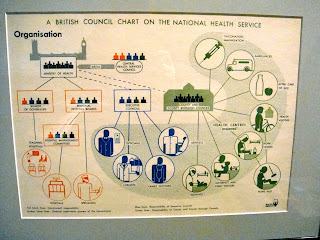
The icons in the Isotype exhibit in the V&A certainly have more personality than the international system of signs, or, they seem to have more personality because we have been conditioned to understand the international system with zero thought, almost not even see the icons. Both systems have their own distinct personalities, though the international system is plainer and requires only one color - any color for the positive shape, and the negative space can be transparent/empty - so in comparison the icons in the exhibit are more exciting to look at. These icons often use a few colors, necessary because they are more complex since they intend to convey more information. Several of the pages the images were very large and the explanatory text was very small in comparison which seem to test the limits of legibility to me, and also some of the posters looked very complex and I could not find a point of entry. But overall it is helpful to have imagery along with text, and definitely more appealing; normally I would not spend several minutes looking at a page of statistics or instructions unless I need to, but these are fun to look at. The style of these particular drawings feel very specific to Constructivism so they might look odd to people not familiar with the style. I find the icons in the exhibit really fun to look at, there is a lot of visual interest, I saw many of the scenes as puzzles that were actually kind of funny to interpret. The blockiness of the forms and text also looked a little childish to me, for example the key to the leprosy chart looked like a page from a childrens book. 

PATTERN


The piece I chose in the Islamic Middle East collections is a large ceramic panel that came from the tomb of Buyanquli Khan, a great mausoleum made for a descendant of Genghis Khan. I was attracted to this piece for it's bright color and strong geometric pattern. I found the ceramics in this room impressive, but most of the decoration on the vases and bowls are very flat, this panel had so much depth in comparison with the deep channels that always surround the ribbon of white that bounces around the rectangle, and the deep purple braided border. This piece is also notable because it at first looks very firm and geometric since the white is so dominant, but on further inspection you realize the interior spaces are very organic, filled with swirling flower-like lines. There is a pattern at work, but the panel also looks sort of random and effortless, like a bolt of lightning ricocheting around inside a metal box. The white also provides some simplicity to prevent the enclosed spaces from being too overwhelming in their intricacy. The piece I chose in the Ironwork collections is a piece of grille from a 17th century German church, possibly part of a tabernacle that would hold the host wafers. In contrast to the Middle East collection where I was attracted to a large and bold piece, in the Ironwork collection I was drawn to this piece for it's subtlety. Many of the pieces I was seeing were all iron, I liked that this piece had beautifully faded gilt, giving it some color interest. The two main differences between these pieces are their sizes and religious connections, connections that are not present in the ceramic piece as it is pure pattern with no focus, and in the iron the religious aspect is hard to see at first but forms the focal point of the grille. Another difference between the two pieces is the difference of depth. The grille is super flat, the only inkling of depth are the thin engraved lines. The similarity I find most interesting between these two pieces are the swirling lines that culminate in circles are very related, despite being from faraway places. This organic type of flowery pattern seems fairly common, but always looks fresh to me.

UNDERGROUND

The Madison Metro system has basically no personality, especially in comparison to the system in London. There has been some effort to liven up the bus stops in Madison on State Street and around the capitol by replacing them with more modern vessels with sauna-inspired wood benches and arched roofs - as far as I know everywhere else the bus shelters remain plain, soul-sucking places. There is the issue of climate, which I suppose is why the shelters in Madison are larger and more enclosed clunky spaces whereas the London shelters have only three walls, and are narrower, allowing their presence to fit into the environment and not clutter it. The signs for the stops: both have the same key features, the transport logo, with the numbers of the relevant lines underneath. The numbers in Madison are all squashed together, and the double digit lines run together looking line one line that is called 47,565,758. On the other end of the spectrum the London signs show each line distinctly and sometimes offer extra info like if the bus runs 24 hours, or only at night. The London signs also make the logo much larger, so the logo by itself functions as the focal point to identify the presence of a stop, in Madison the logo looks like an afterthought and we just use the presence of a blue rectangle to identify the stop. The logos also show the level of design that went into each system, the Madison Metro logo feels devoid of any flavor, purpose, or relation to the city. The London Transport logo feels at home in this setting, and related to the classic but avant-garde style of London. Perhaps because this is a larger city they put more emphasis on clarity, because the Madison system requires a lot of knowledge to decipher. Here, you need only look at the signpost to know where you are - they include the stop name on the sign - and what direction the buses will go - they include later stops. Continuing in their pursuit for greater clarity, the maps in the bus stops in London only show the lines that run from that stop, while the maps in Madison always show all the lines, making them such a headache to decipher.


OBJECT OF APPRECIATION

My favorite object (so far) from the V&A is a book by Wang Xu, published about 10 years ago in Beijing. The piece is called Creative Characters, the description says it is a "collection of vernacular typographical works originating from rural China." I'm not sure how the pages on display are typographical - but I also have no knowledge of Asiatic languages - the book just caught my eye. I was very drawn in by several qualities: the large size, the binding, the vivid red prints, and the ink-stained edges. I would return to see this piece to appreciate the fine details in each print, which cannot be fully appreciated from my photos, to try to understand the binding technique, and also to see if the display pages are ever changed. I like to look at the object and imagine what it would feel like to hold, to feel the paper, to turn the pages, and to inspect the binding.